Mluvící tlačítka
A free Shopify theme paired with custom sections. No premium license, no rebuild from scratch—just a redesigned product page, custom sections, and a structure that matches the product's quality.
O projektu –
Context and starting point
Talking Buttons teach cats and dogs to name their needs. Josef Rousek's brand aims to become the Czech equivalent of FluentPet, anchored in evidence-based methodology. The original site didn't match that ambition—a free theme without identity, with educational content buried in long blocks of text. It needed presentation on the same level as the product itself.
What we did –
Specific moves
Visuals –
A look at the result
№ 01
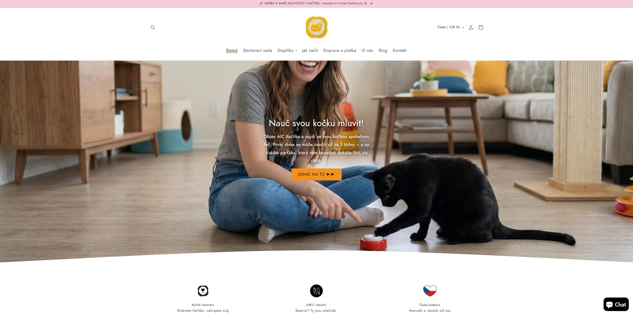
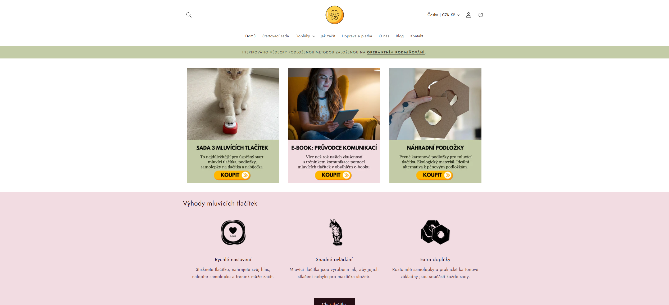
A homepage that opens with the brand, not the catalog
A product grid replaced by lifestyle photography, a clear value proposition, and three concrete benefits. Visitors grasp what they're buying and why within seconds.
№ 02
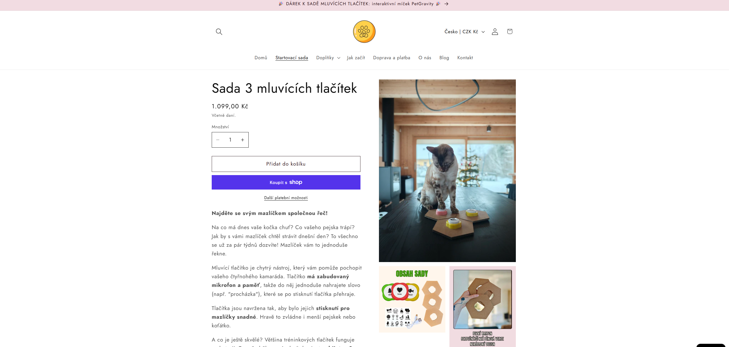
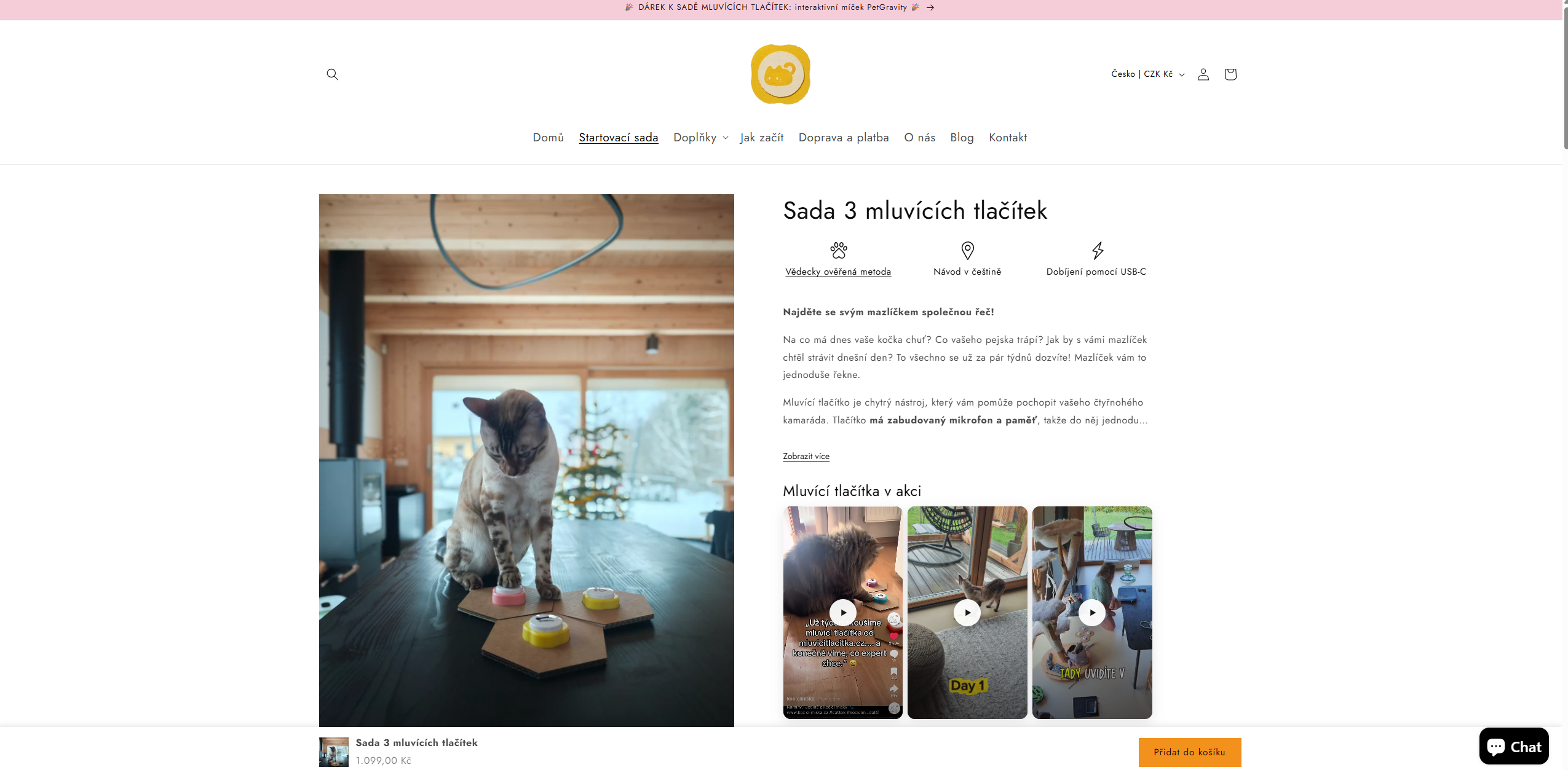
A product detail with a clear information hierarchy
From one long description to a structured path: benefits in icons, videos from real customers, and sections answering typical purchase questions.
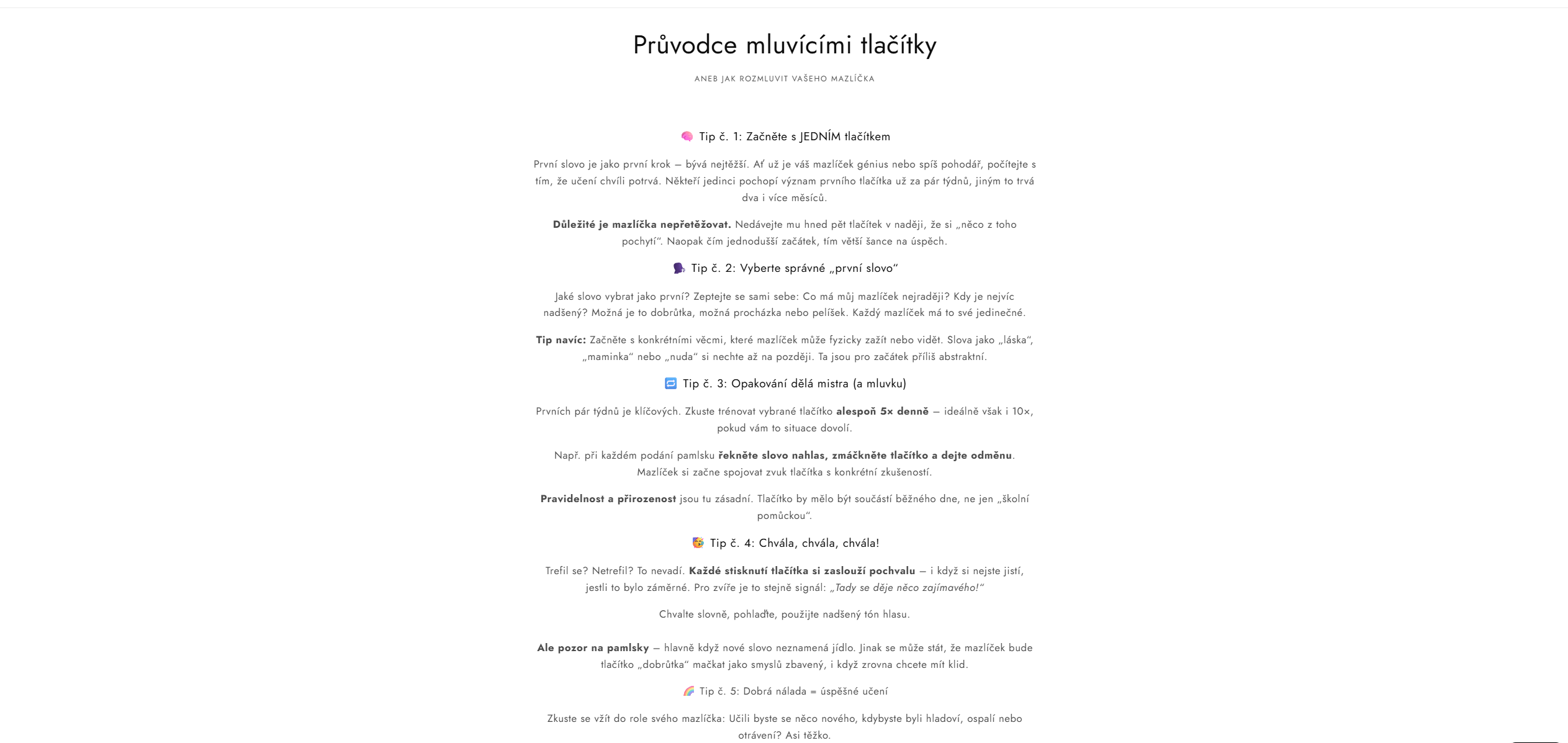
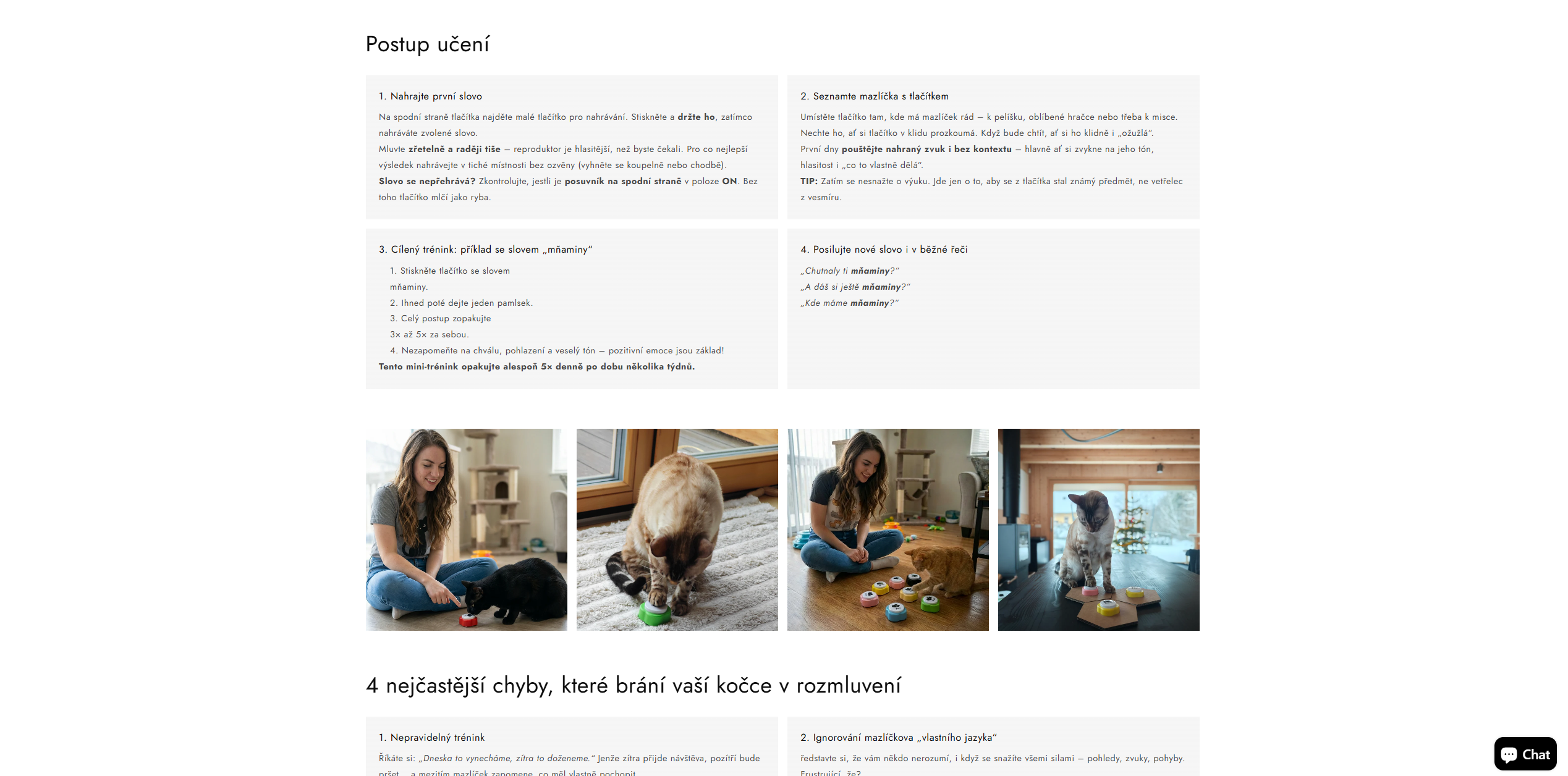
№ 03
From long-form text to structured tip cards
For training products, educational content decides whether the customer keeps it. The method broken into clear steps plus a section on common mistakes. Same know-how, much higher odds the customer actually adopts it.
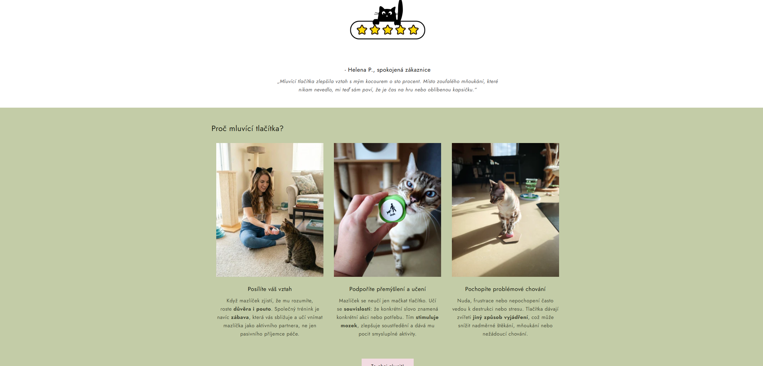
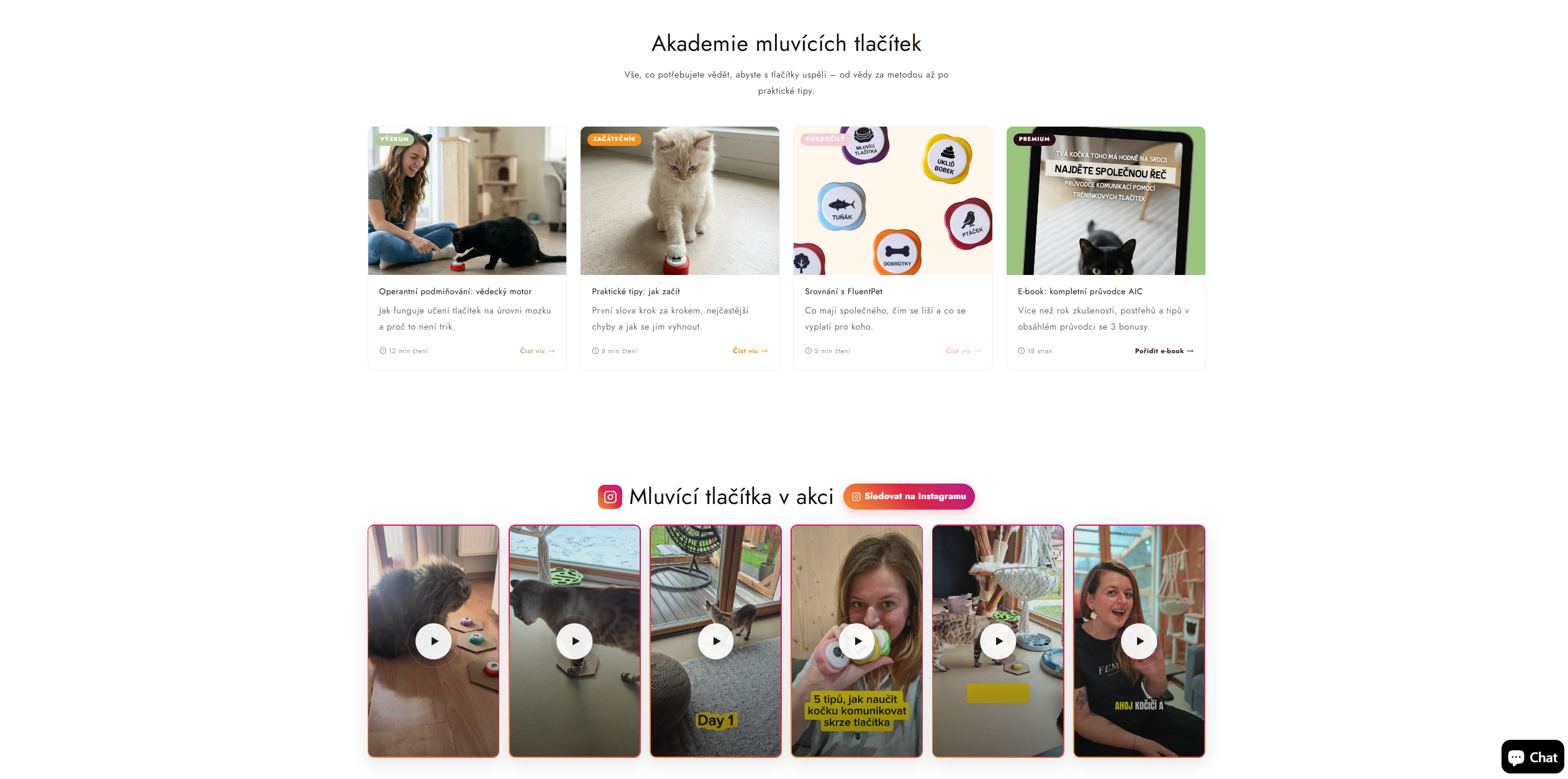
№ 04
Textbook social proof
Reviews are no longer buried in the footer—they accompany the customer across key pages. The Academy adds a knowledge hub that helps both undecided visitors and Google.
Approach –
A free theme as a launchpad, not a compromise
Instead of buying a premium theme or paying for a full rebuild, we took the free Colorblock theme and added custom sections on top—each with its own editor settings.
The sections are independent blocks that can be moved, disabled, and duplicated to other product templates (ebook, mats) in the editor. When the client wants to add a new card or change an icon, he doesn't open code—he clicks in the editor. No lock-in to anyone's ecosystem, including ours.
Result –
From a bare theme to an e‑shop nobody can tell apart from a custom build
✕ Before
- Product detail without visual hierarchy or social proof
- Homepage without brand storytelling or emotional connection
- Educational content in a format that didn't motivate readers to finish
- Reviews buried in the footer, no content channel for building authority
- FAQ without the ability to quickly find an answer by context
✓ After
- Product detail with structured hierarchy and integrated social proof
- Homepage as a gateway to the brand, not just a product catalog
- A dedicated knowledge hub for authority and SEO
- Social proof present across the key pages of the buying flow
- FAQ with live filtering by buying context
“An e‑shop that looks like a bespoke build—running on a free theme the client manages himself. No commercial license, no dependence on a third-party vendor.”
Mobile –
Designed for phones, not adapted to them
Most purchases in this category happen on phones. Custom sections were built mobile-first, not adapted from desktop afterwards. The hero, "What you get," filterable FAQ, and Instagram Reels carousel all hold up without losing information.
.jpg)
.jpg)
.jpg)
Let's do this –
Need a new e‑shop or want to give your current one a serious upgrade?
We build custom sections where premium themes hit their limits. Without expensive rebuilds and without dependence on a third-party vendor.